
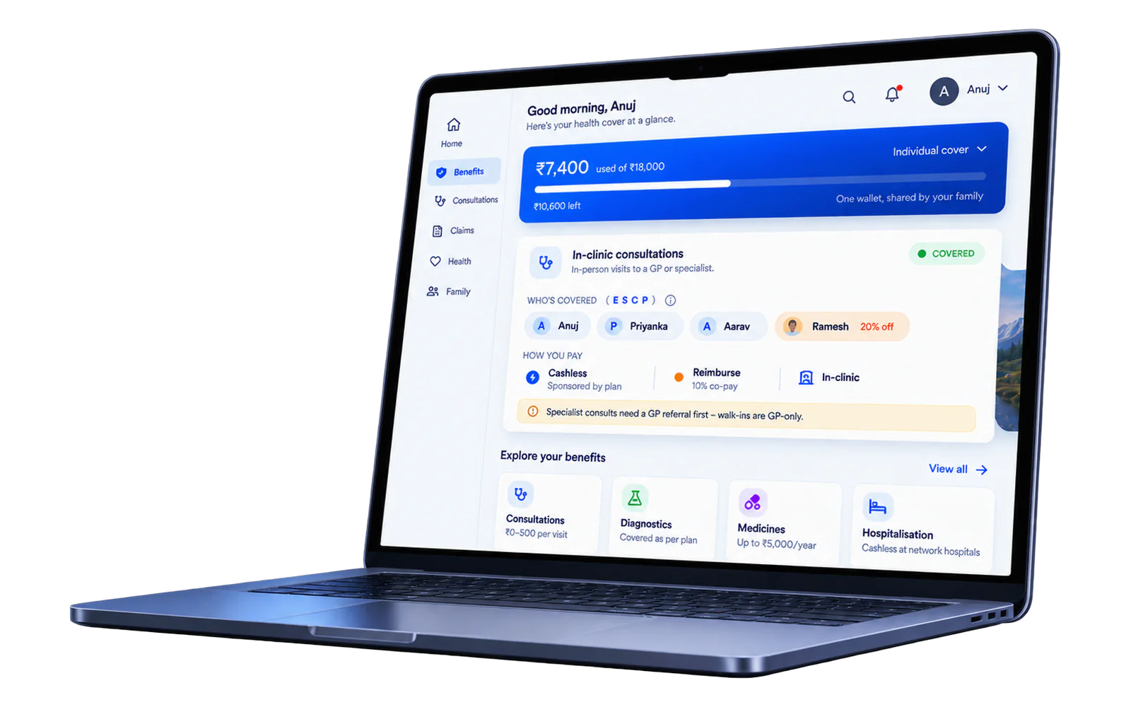
Who, why, and what
Six research sources revealed that members knew cashless existed but couldn't understand their benefits — what's included, what's excluded, who's eligible, what the limits are — so they defaulted to reimbursement, waiting weeks for money they could have saved in two minutes. I audited live client configurations, mapped the existing journey, and found that every policy — no matter how custom — maps to one of five structural patterns based on how money flows. After presenting the pattern-based system to stakeholders, the team aligned on prioritizing comprehension over persuasion.
Research
Working with Data, Backend, Ops, Onboarding, Sales, and Client Servicing, I synthesized member interviews, customer-service tickets, claims data, and stakeholder conversations.
The diagnosis: the problem wasn't persuasion. Members knew cashless existed but couldn't tell what their plan actually covered, so reimbursement became the safe default.
| Source | What we heard | Theme |
|---|---|---|
| Member interviews | "I know I have a plan but I don't know what it actually covers." | Comprehension |
| CS tickets | Repeat contacts asking "is this covered?" and "who in my family is covered?" | Comprehension |
| Claims data | Cashless-eligible services being claimed via reimbursement | Discovery |
| Onboarding | New employees receive a plan with no explanation of its structure | Limits |
| Client Servicing | HR fields benefit questions the platform should answer | Comprehension |
| Sales · policy audit | Custom packages force-fitted into one rigid UI; sub-limits overstate the wallet | Trust |
- 1Gets plan from employerNo explanation of structure
- 2Logs into CNHNo guided onboarding
- 3Lands on benefits pageFlat grid, no hierarchy
- 4Tries to understandNo detail page, no per-benefit balance
- 5Needs a serviceCan't tell what's covered
- 6Goes to providerPays out of pocket
- 7Files reimbursementWaits weeks
- 8Calls CSRepeat contact, same issue
Members were shown per-service limits that, added together, promised far more than the wallet could ever pay out. The dual-constraint display in P2 exists because of this.
Reveal, don't persuade
The brief was behavioural: nudge members toward cashless. Research closed that door. Cashless was already cheaper and faster — the incentives were never misaligned. Nobody was weighing two paths; members couldn't tell whether their plan covered what they needed. That moved the project from convince to reveal.
Make the better path the obvious path — not by hiding the worse one, but by making the better one unmissable.
How it shows up in the product
Payment path ordering
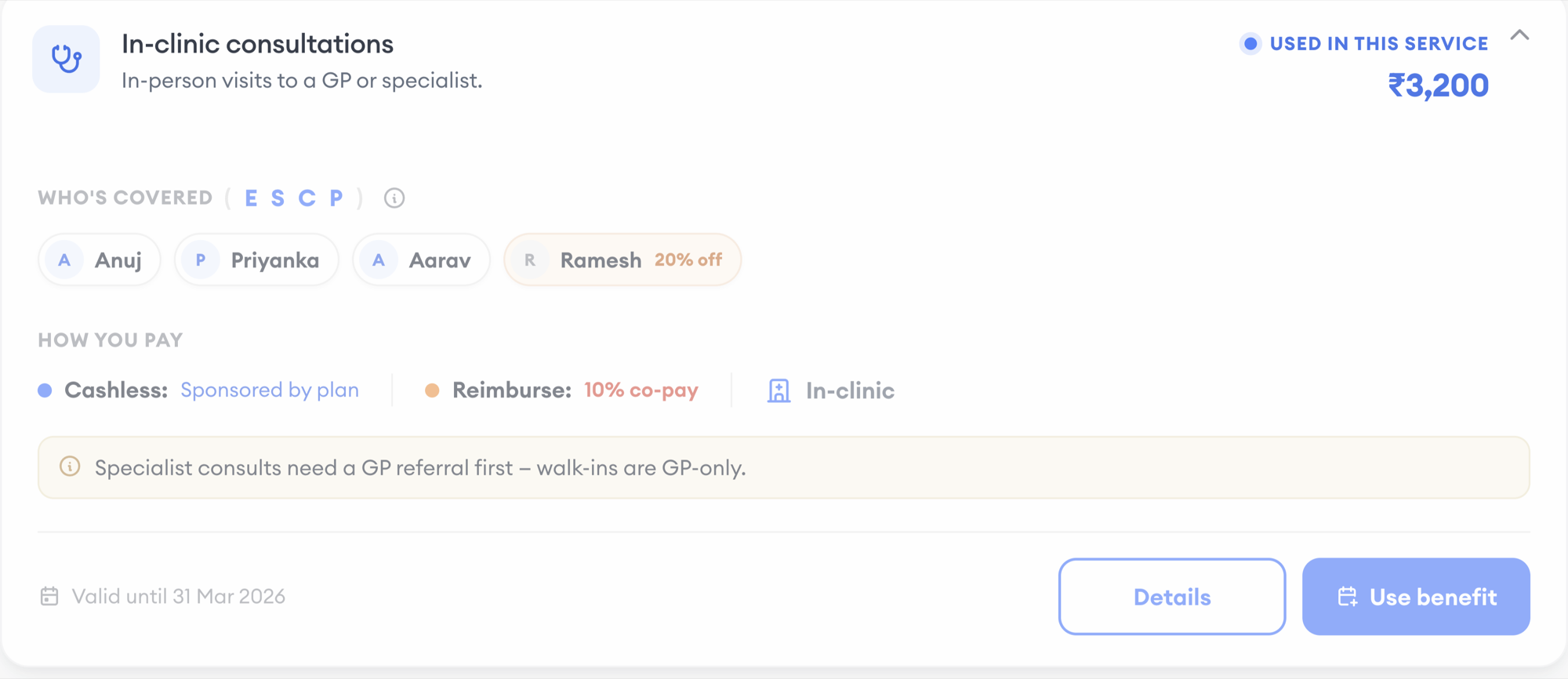
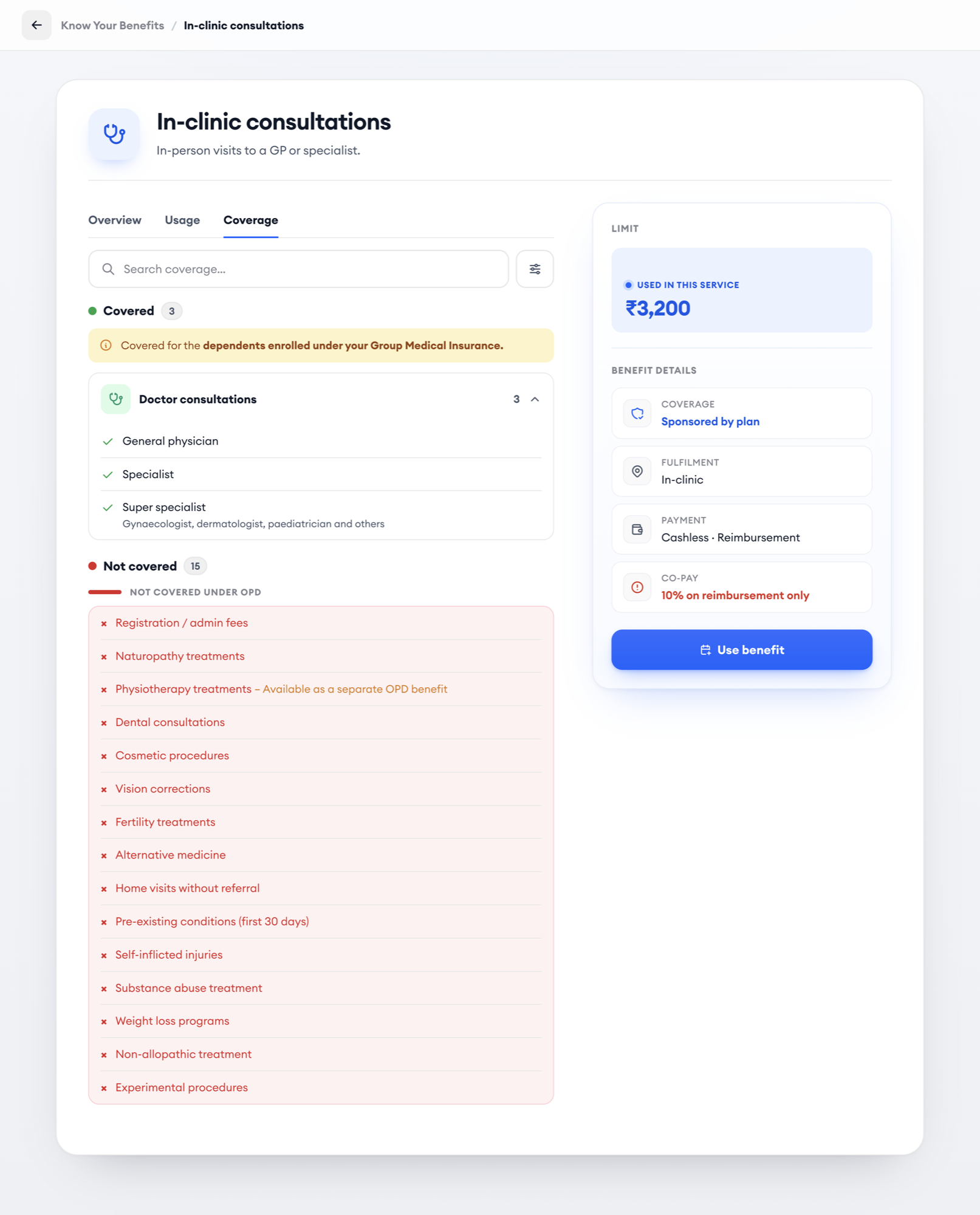
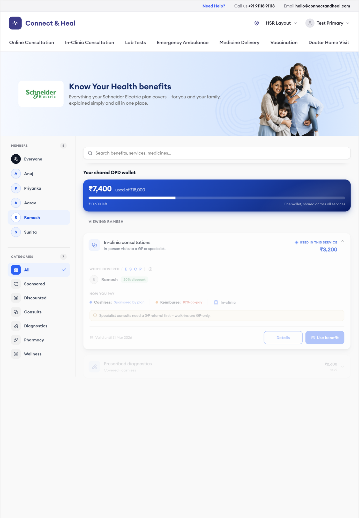
Cashless first — "Sponsored by plan." Reimbursement second — "X% co-pay." Same information, honest order.
Wallet context on every card
"Used in this service: ₹3,200" — the member knows where they stand before they act.
Guided first-run tour
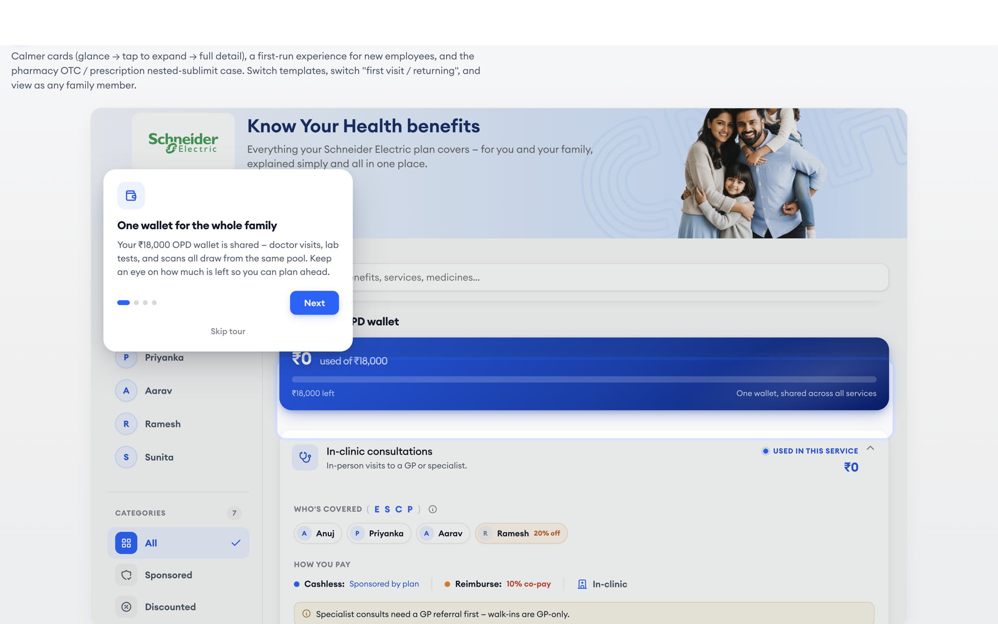
Four steps, customised per pattern, auto-starts on first visit. The product teaches itself.
Contextual nudge carousel
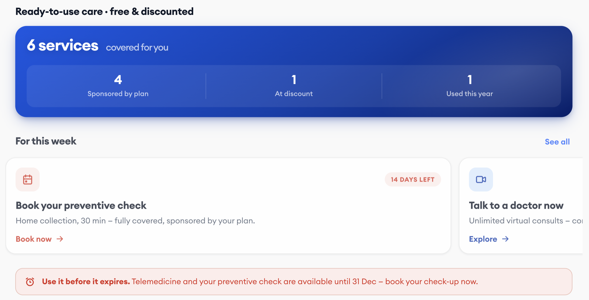
"For this week" — expiring plan, new benefit, unused check-up. Relevant, not a banner.
Infinite policies, five patterns
Sales sells every client a custom package, and the UI was force-fitting all of them into one rigid layout. Auditing live client configurations with Sales and Onboarding, I found that every policy — however custom — maps to one of five structural patterns based on how money flows.
This became the backbone of the system: design once per pattern, and any policy Sales can sell is covered.
One wallet hero, five patterns live screens from the prototype · click to switch
Target personas
Employees use benefits but don't understand them. HR fields questions the platform should answer. The business loses margin on every reimbursement. Sales sells custom packages into one rigid UI.
Employee
- Understanding what's covered
- Using cashless correctly
- Filing claims when needed
HR Admin
- Fielding benefit questions
- Customising plans
- Onboarding members
CNH Business
- Tracking cashless margin
- Reducing Ops overhead
- Client retention
CNH Sales
- Selling custom packages
- Demoing the benefits UI
- Client onboarding
Existing user journey with pain points
I mapped the journey into phases to surface the highest-friction tasks and align the team on what to act on. The map shows members know cashless exists — but they don't understand their benefits: what's included, what's excluded, how the process works, who's eligible, what the limits are. The comprehension gap is the friction.
- Onboard · 1Gets plan from employerNo explanation of structure
- Onboard · 2Logs into CNHNo guided onboarding
- Understand · 3Lands on benefits pageFlat grid, no hierarchy
- Understand · 4Tries to understandNo detail page, a limit never tied to a benefit, cryptic E/S/C/P codes
- Use · 5Needs a serviceCan't tell if it's covered, for whom, or how
- Use · 6Goes to providerPays out of pocket to be safe
- Recover · 7Files reimbursementWaits weeks · manual claim for Ops
- Recover · 8Calls CSRepeat contact, same question
Jobs to be done
I worked with the team to identify every user story through the JTBD lens, then mapped each to its current pain and design response across five jobs: Understand, Check, Verify, Use, Find.
| Job | User story | Current pain | Design response |
|---|---|---|---|
| Understand | Know what's covered and how it works | No detail pages, no inclusions or exclusions | Detail page with Overview and Coverage tabs |
| Check | See how much balance I have left | A limit existed in one variant, never tied to a benefit | Wallet hero that adapts to the policy pattern |
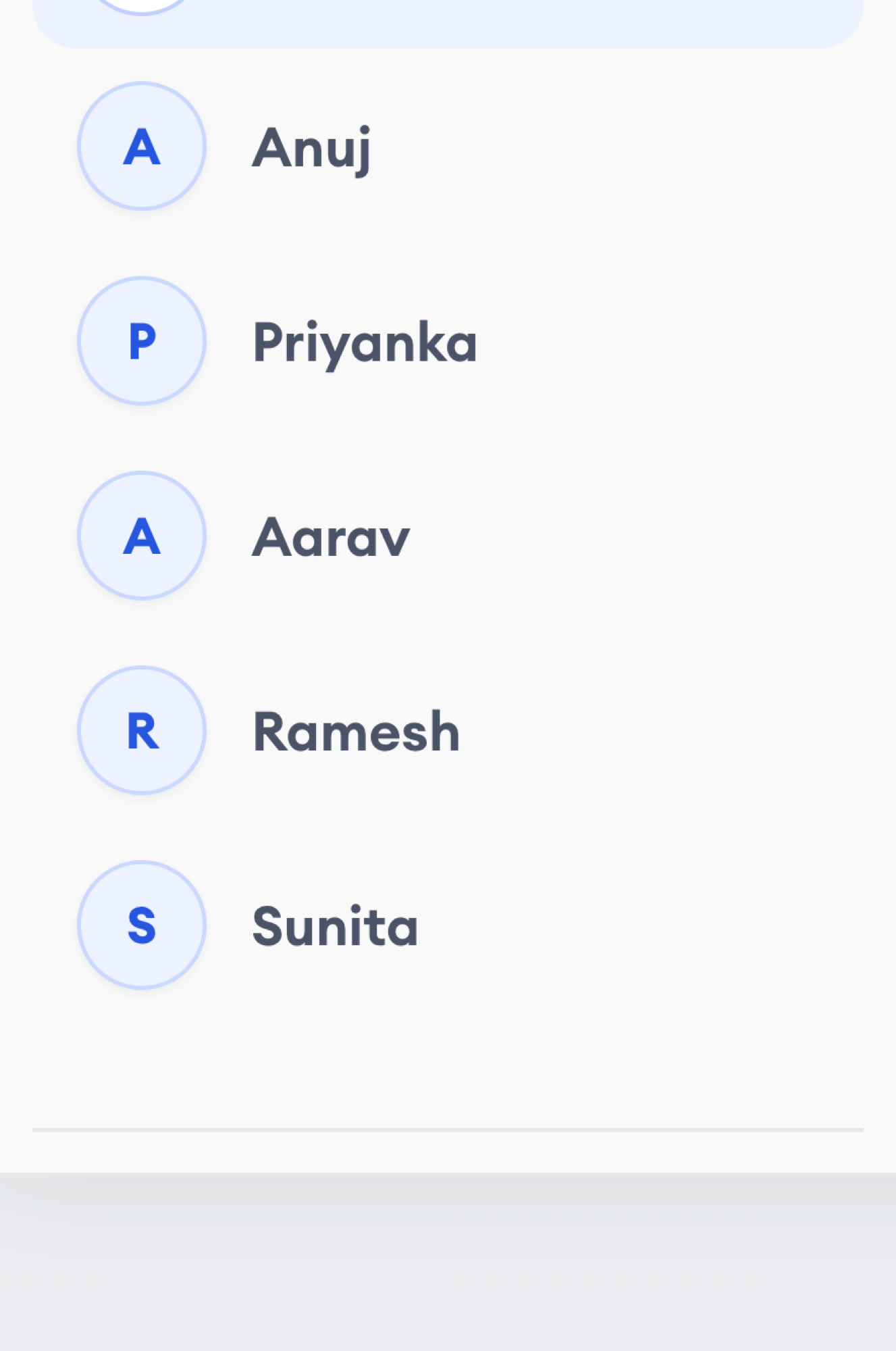
| Verify | Know if a benefit covers me and my family | "E, S, C, P, I" — cryptic eligibility codes | Member filter sidebar with named avatars |
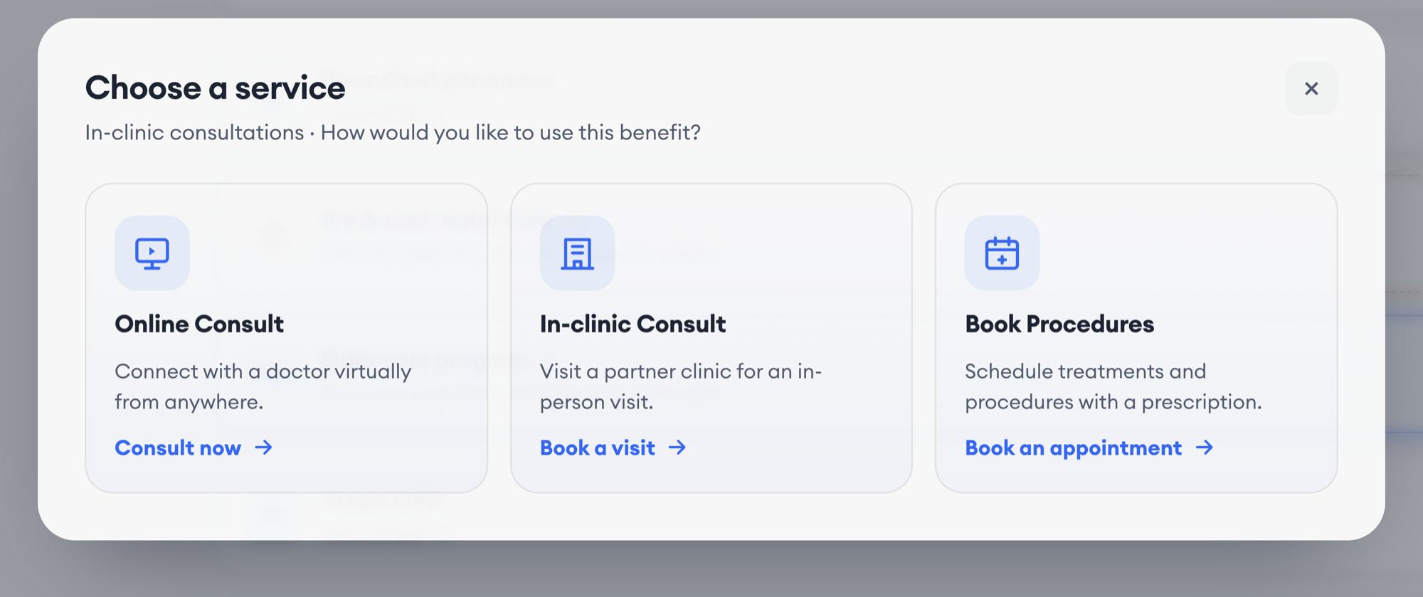
| Use | Know the process to book correctly | No how-to-use, no fulfilment clarity | Payment paths and a Service Chooser modal |
| Find | Check if a specific procedure is included | No search, no way to check coverage | Coverage Explorer across 71 procedures |
Action plan
The JTBD map let the team align on a prioritised plan with defined scope, known constraints, and design impact — turning an ambiguous problem space into a roadmap. We scoped the first launch to P0: the comprehension layer and the pattern system.
| Priority | Work item | JTBD | Constraint / dependency | Status |
|---|---|---|---|---|
| P0 | Detail pages with Overview, Members, Coverage tabs | Understand | Benefit metadata from Backend | Shipped |
| P0 | Wallet hero adapting to five policy patterns | Check | Pattern detection logic with Backend | Shipped |
| P0 | Member filter sidebar with avatars | Verify | Family data already available | Shipped |
| P1 | Payment paths + Service Chooser modal | Use | Booking flow integration | Shipped |
| P1 | Coverage Explorer (71 dental procedures) | Find | Procedure list from Ops | Shipped |
| P1 | Guided first-run tour (four steps per pattern) | Understand | — | Shipped |
| P2 | HR configuration tools | — | Requires the pattern system first | Deferred |
| P2 | White-label theming | — | Design-system dependency | Deferred |
| Killed | Per-service caps configuration | — | Backend can't enforce (many-to-many) | Killed |
Define how members navigate their benefits
With scope locked, I mapped the ideal path from "I just got this plan" to "I booked a service." The goal: reduce cognitive load at every step, surface the right information at the right time, and make five policy patterns feel like one coherent experience.
Benefits page information architecture
I ran working sessions with Backend, Frontend, Ops, and Onboarding to define and align on the page architecture — how the wallet, sections, and detail pages would adapt to all five patterns while sharing one codebase.
Benefits flow exploration
Grounded in the research and the IA, I explored several layouts. Testing with internal teams surfaced the core issues: everything shown at once overwhelmed members, technical labels like "T1, T2" confused them, and cryptic eligibility codes made coverage unclear. Members didn't know who was covered or how to use their benefits.
- Policy patterns
- Eligibility
- Information density
- Card structure
- Detail pages
- Wallet
Member journey optimization
Acting on that feedback, I consolidated the scattered information into a progressive flow. Members land on a wallet hero that matches their pattern, browse grouped sections, tap to expand cards, and reach detail pages with clear tabs. The path from "what do I have" to "how do I use it" went from eight confusing steps to six clear ones.
Design evolution
Comprehension across five policy patterns needs to feel seamless. After testing the initial prototype with internal teams, I persuaded the team to hide the pattern complexity from members — no T1/T2 labels, no cryptic codes. The UI adapts automatically while members see one consistent experience.
Design ideation
I tested three layout models: a flat list showing every benefit detail at once, grouped sections with expandable cards, and progressive disclosure with a dedicated detail page per benefit.
Trade-offs
The flat list overwhelmed members — too much information, no hierarchy. Grouped sections were better but still dense. Research showed members wanted to glance first and drill down only when needed. Progressive disclosure with detail pages matched that mental model.
Flat list
All details visible at once — wallet, amounts, eligibility codes, validity. Members couldn't find what they needed.
Grouped sections
Better hierarchy, but cards still carried too much. Expandable helped; the page was still overwhelming.
Progressive disclosure
Glance at the card → tap to expand → detail page with Overview / Members / Coverage tabs. Matched how members actually think.
Component design
Working with Frontend, I designed the core components that make the page work across all five patterns — consistent where it should be, adaptive where each pattern needs to surface its own information.
| Component | Purpose | Adapts to pattern? |
|---|---|---|
| Wallet hero | Balance, used and remaining, at a glance | Yes — layout changes per pattern |
| Benefit card | Glanceable summary, expands on tap | No — consistent across patterns |
| Member sidebar | Filter by family member with avatars | No — shows all covered members |
| Detail page | Overview / Members / Coverage tabs | Yes — Coverage shows pattern-specific limits |
| Service chooser | Modal showing payment paths before booking | Yes — cashless vs reimbursement options |
Hard decisions
Two calls shaped the product more than any screen. I pushed the team from one rigid layout to a pattern-based system despite the higher upfront cost. And I killed a feature — configurable per-service caps — after a working session with Backend surfaced that the many-to-many data model couldn't enforce it. Shipping an honest dual-constraint display beat promising HR a control the system couldn't keep.
Pattern-based system over one adaptive layout
Cost: a pattern registry and shared component system. Gain: any policy Sales sells is covered without a redesign.
Full layered wallet context over hiding it
Collapsed = one number. Expanded = pool context. Detail = full cashless/reimburse split. Anxiety managed by disclosure, not omission.
Configurable per-service caps
Backend confirmed the data model couldn't enforce it. Built a dual-constraint display instead — honest about both limits, no false promises to HR.
One card, every benefit shape
Five patterns describe how a plan holds money. Inside a plan, every service renders through one card component — which had to absorb fourteen visual variants, eight limit shapes and six lifecycle states without the member ever learning the vocabulary.
Card variants real cards from the prototype
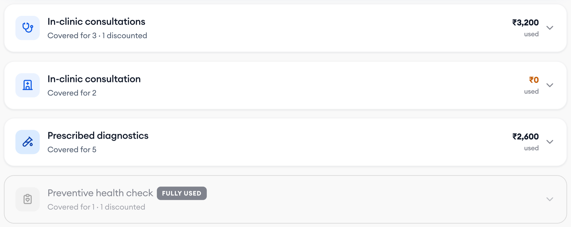
Every benefit renders through one card component. Across the five plan patterns it renders 39 distinct services — six body variants cover the states a benefit can be in, and modifiers layer on top: nested bars, per-claim caps, member co-pay, discount banners, programme strips.
The constraint I held: the collapsed row is identical in every variant — icon, name, one-line status, one balance figure. Only the expanded body changes. A member scanning the page never has to re-learn how to read a row.
Limit shapes click a shape · real values from the prototype
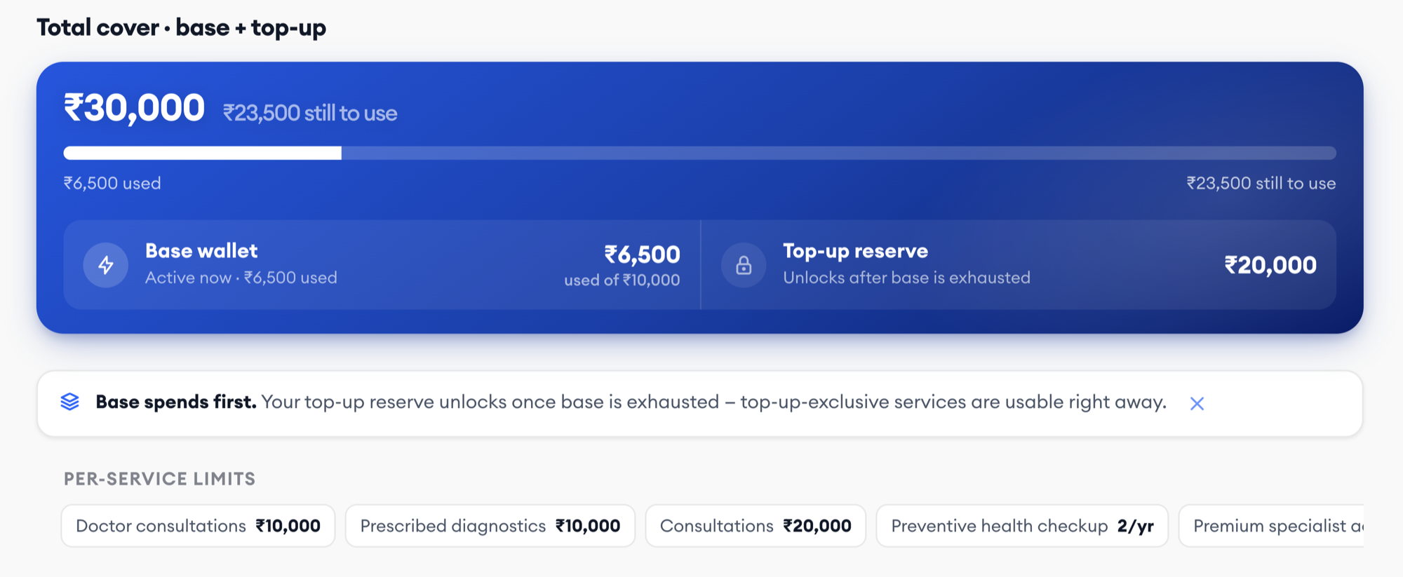
Sales sells limits, not layouts. A benefit might draw from the shared pool, own a ring-fenced wallet, carry nested sub-limits, or be capped separately for cashless and reimbursement. Each needs a different balance display — but the same card anatomy.
The rule I set: one number when collapsed, the full structure on expand. The member sees "what's left"; the structure only appears when it changes what they can do.
Lifecycle states
A benefit isn't just "available." It can be locked behind a life event, waiting on enrolment, fully used but still discounted, or discounted-only from day one. Each state needed an honest label and a clear next action — never a dead end.
The rule I set: nothing disappears. A used-up benefit stays visible with its self-pay discount, because hiding it makes the member think they never had it.
Payment paths
Sponsored by plan
Shown first, always. Nothing to pay, nothing to claim back.
0%, 10% or 20% co-pay
Shown honestly with its co-pay, so the member can still choose it when they need to.
15–30% member rate
For discounted-only benefits and used-up ones. Never dressed up as sponsored cover.
The shipped experience
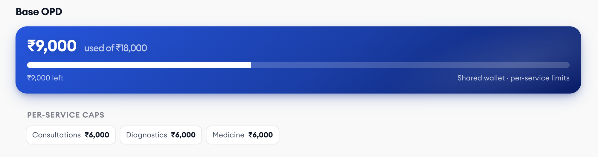
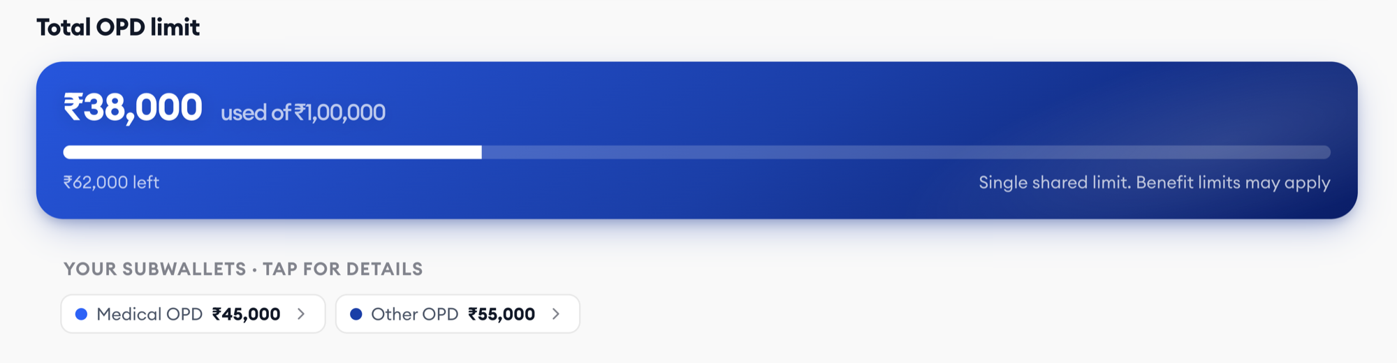
One benefits page that reads the policy construct and composes itself. The wallet hero, strip, and detail pages adapt to the pattern; cards, member filters, and the coverage explorer stay identical. Members see one coherent experience regardless of how custom their plan is — or how oddly a single benefit is limited.
Wallet hero — one component, five patterns

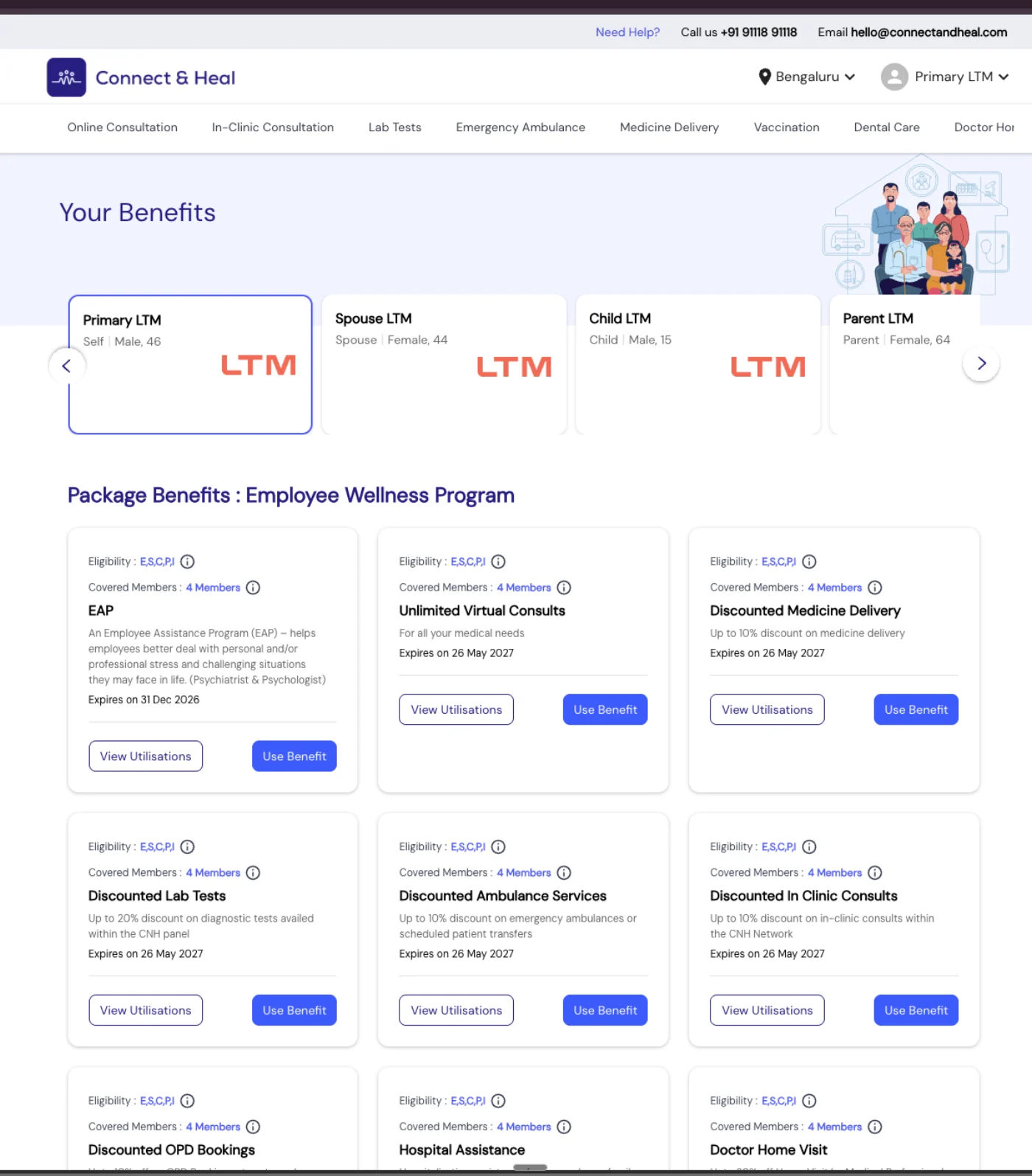
Before and after the page this replaced
The redesign is only legible against what it replaced. This is a benefits page members were actually using — the package-benefits variant. A second variant carried a plan limit as a bar above the cards, so the old product did show a number; what it never did was connect that number to any individual benefit.
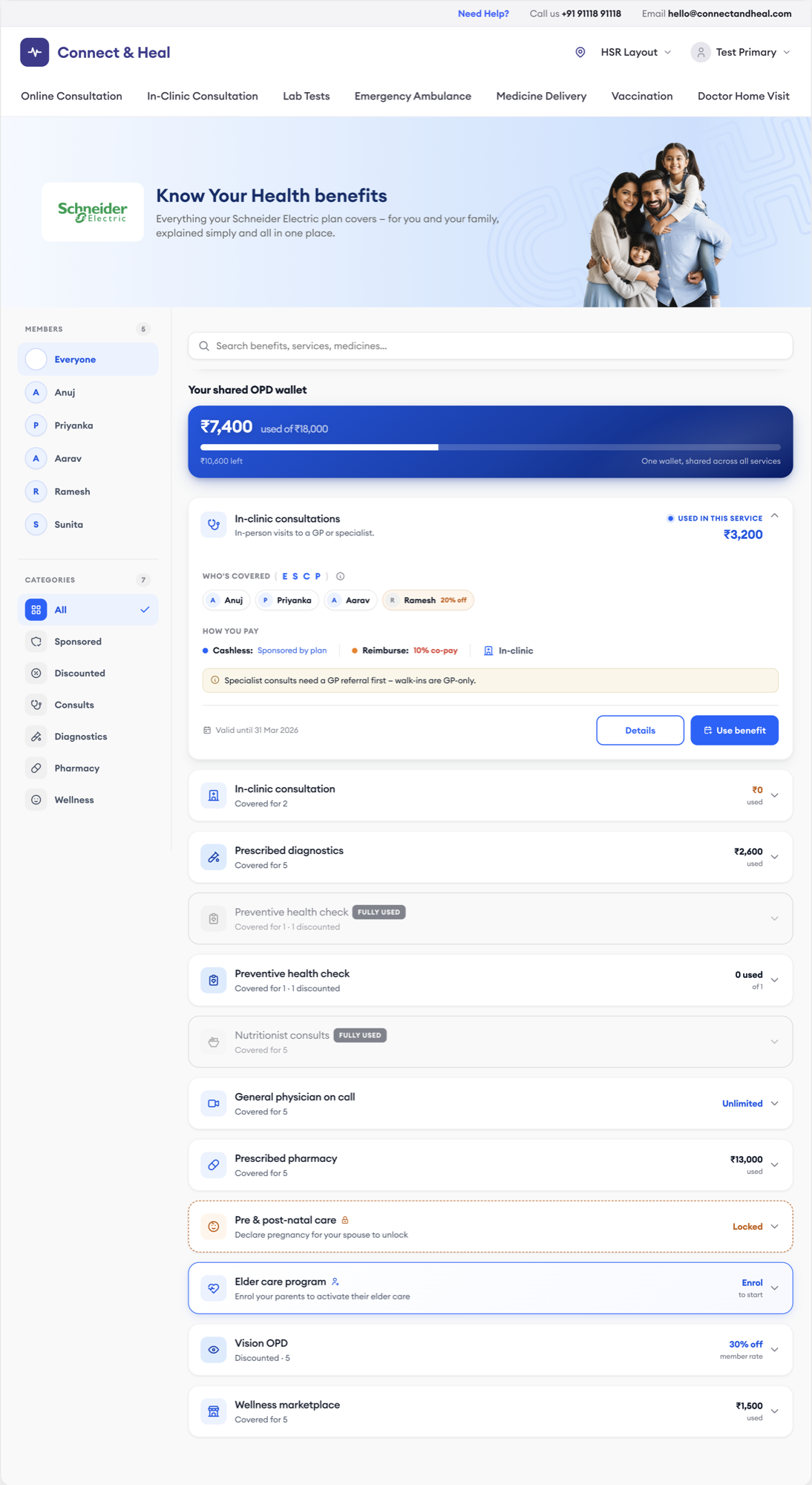
Responsive — web and the mobile app 5 constructs · 2 surfaces
The benefits page runs on the web portal and inside the Connect & Heal app. Mobile is not the web layout reflowed — it is its own surface with its own information architecture, built from the same component library and driven by the same construct rules. A plan that composes itself on a 1180px page composes itself the same way on a 390px screen, including the pattern that has no wallet to show.
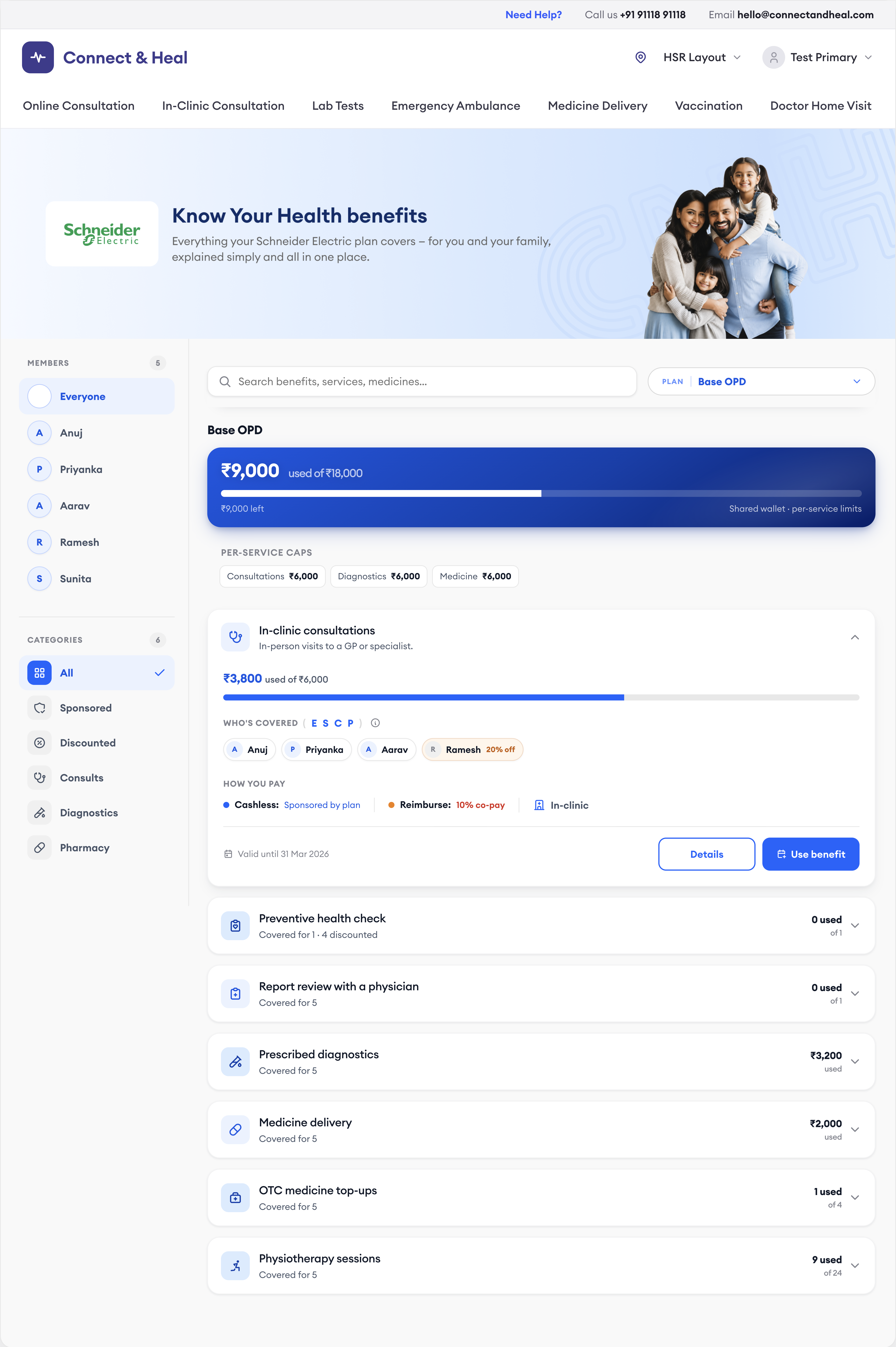
Web · 1180 — sidebar filter, wide wallet, horizontal card rows
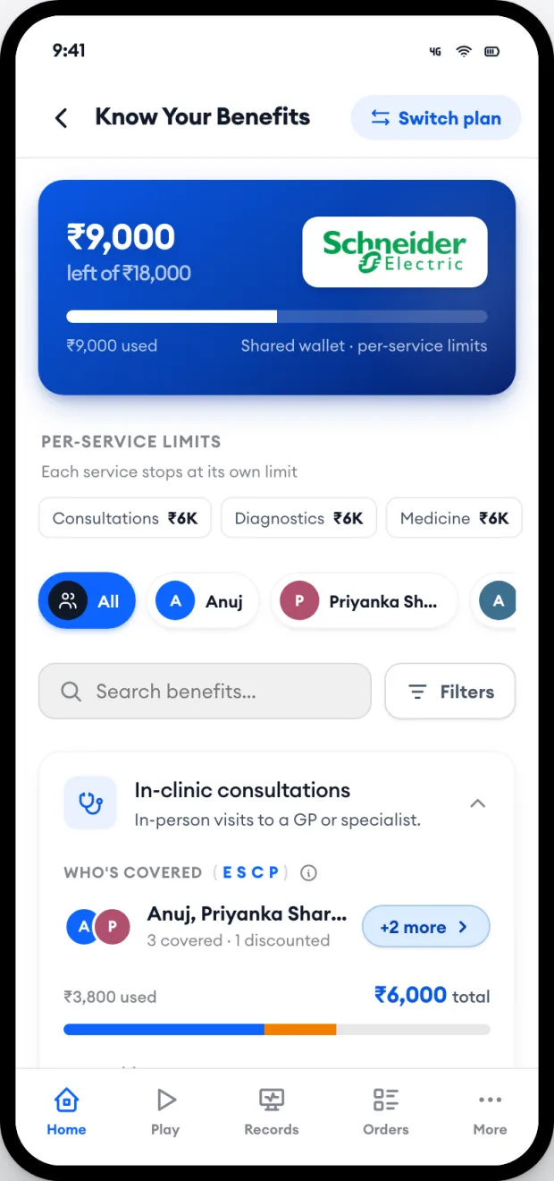
Mobile · 390 — plan logo on the wallet, limit chips, pill filter, bottom bar
The same five constructs, on the phone.
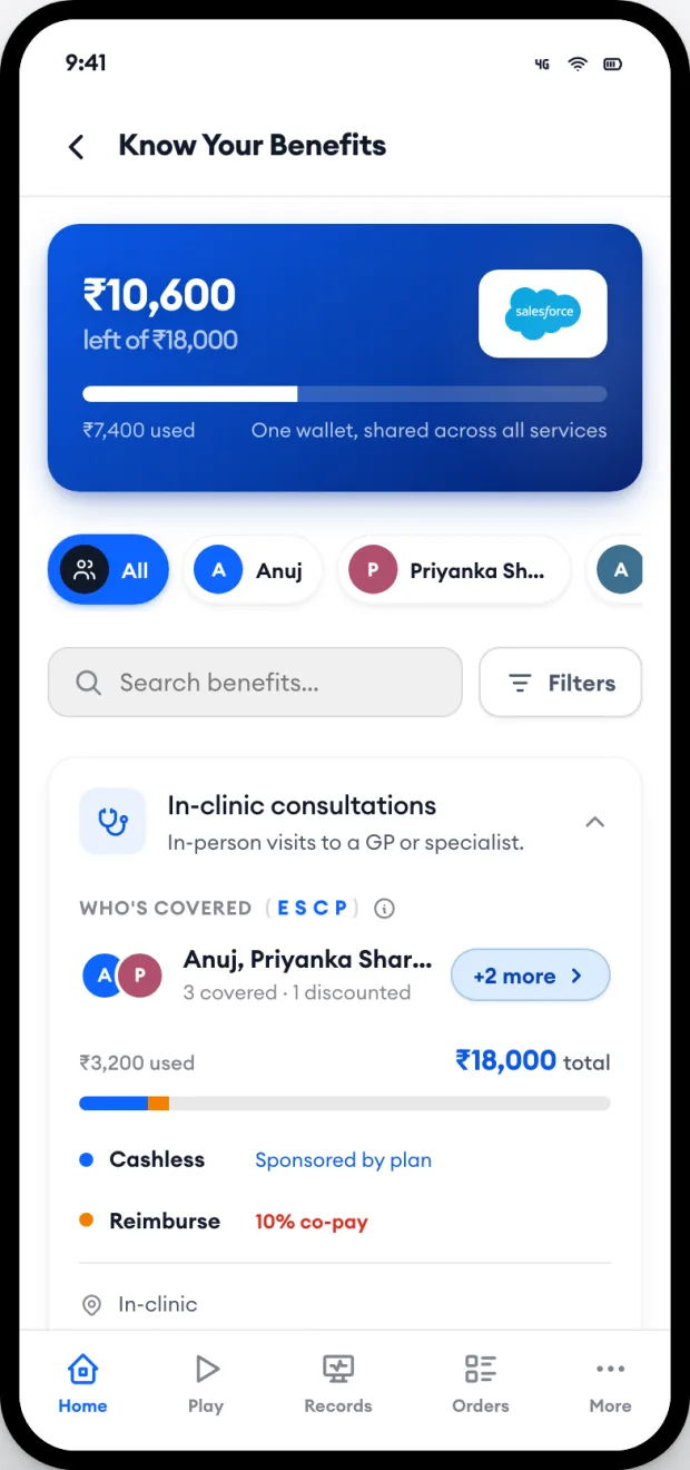
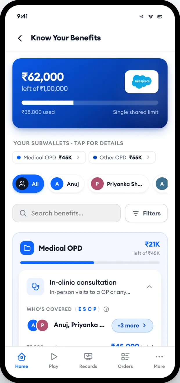
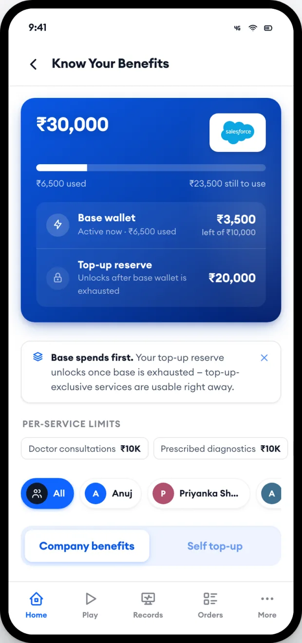
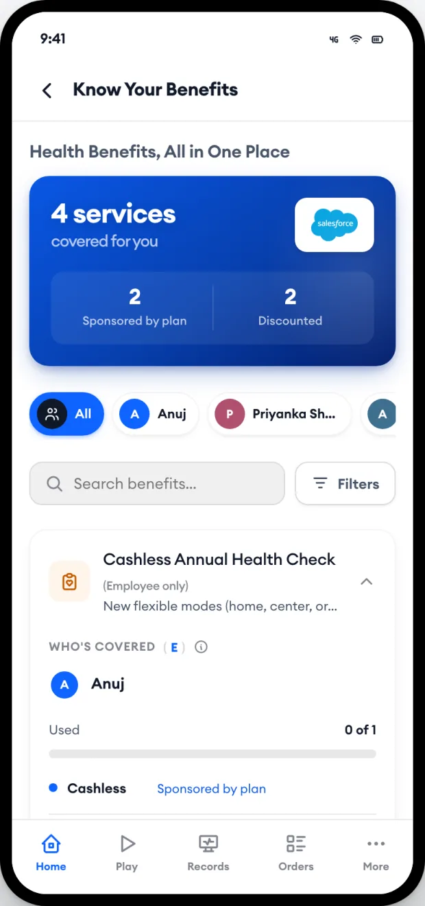
What each screen solves
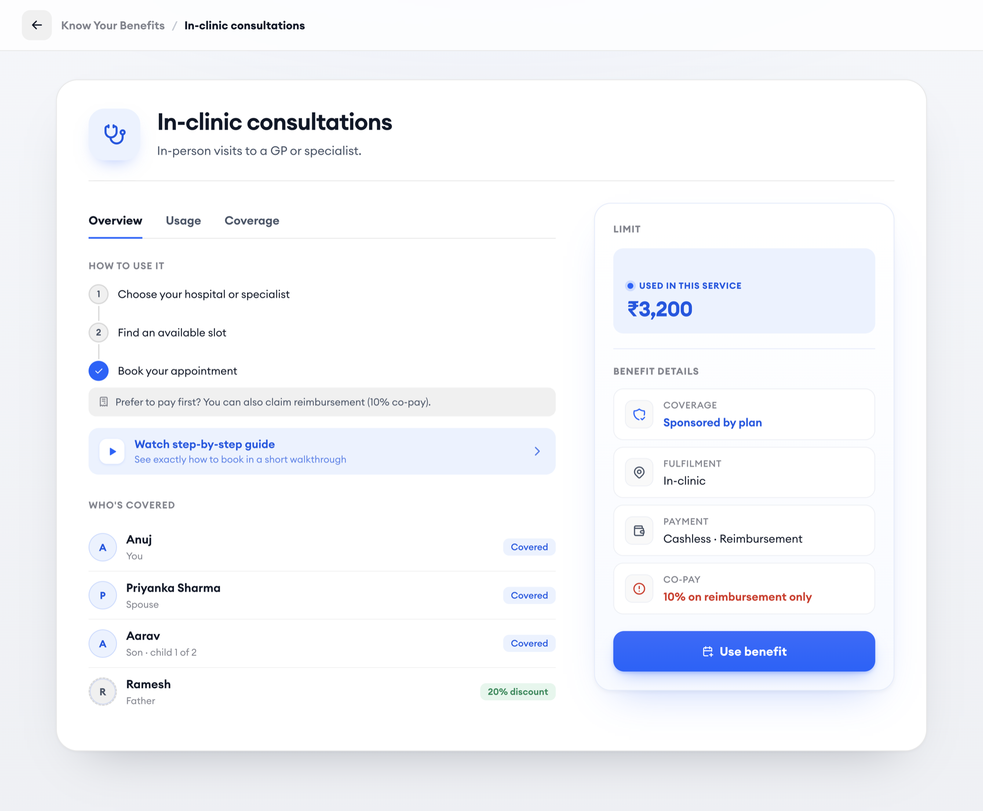
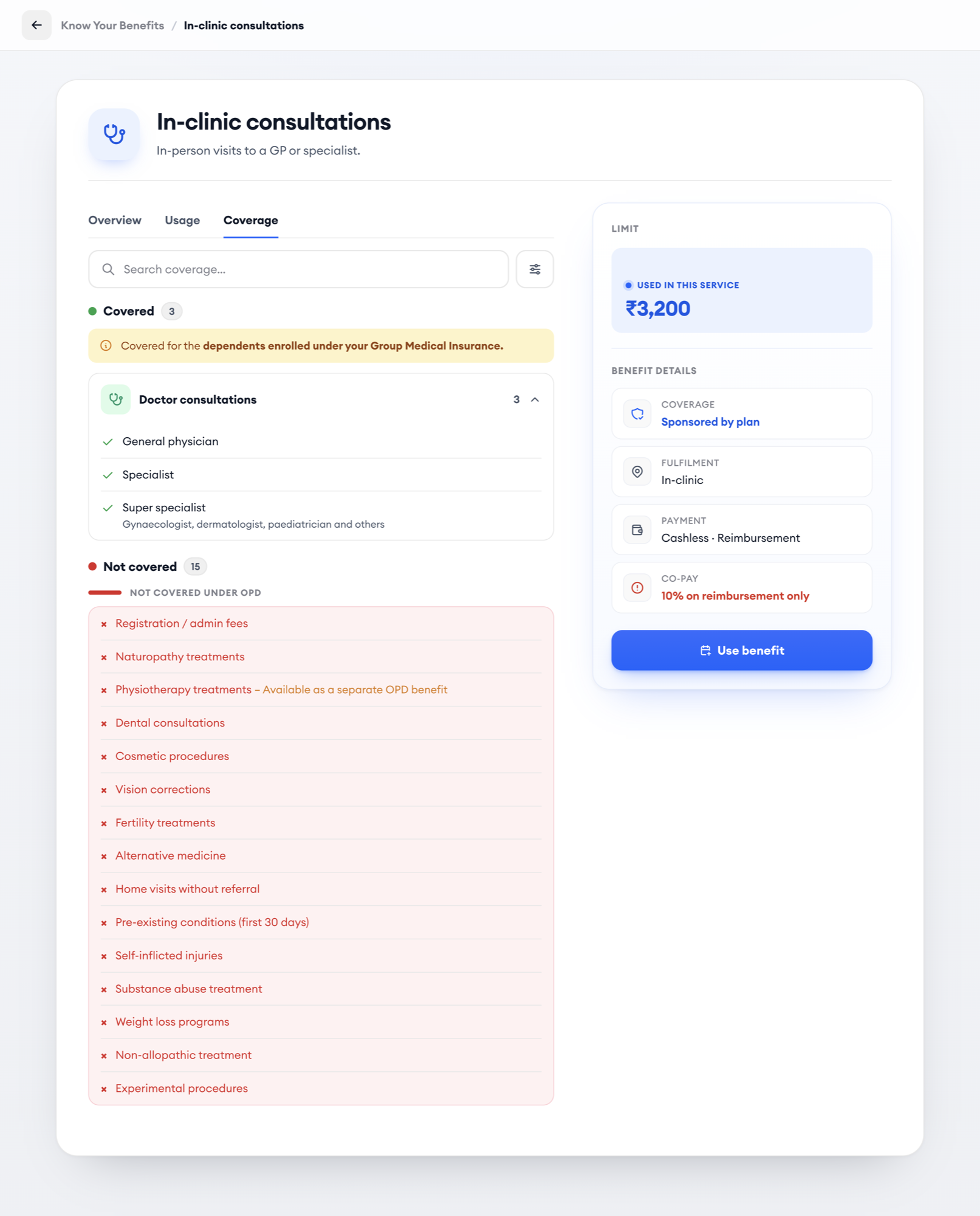
Validation
Before handoff I walked the prototype through with Ops, Client Servicing, and Onboarding — the teams who field member questions daily — using real client configurations across all five patterns. Two changes came out of it: the Service Chooser modal ("Use benefit" was too vague) and relocating "Used in this service" into the card header so it was visible without scrolling. Every pattern was verified with automated screenshot comparison after each iteration.
Impact and what I learned
The case opened on margin, so it has to close on it. Every target below is downstream of one behaviour: a member who can tell what their plan covers stops paying out of pocket to be safe.
Success
Make the cashless route understandable before booking, so more eligible members choose it instead of paying upfront and claiming reimbursement later.
“Is this covered?” “Who in my family is covered?” “How much is left?” “Can I use this cashless?” — answerable directly from the benefits experience.
About 62% faster to interpret eligibility, remaining balance and payment method. Not faster navigation — the member reaches the correct understanding faster.
Clearer eligibility, network, co-pay and payment information should reduce avoidable reimbursement journeys for services that can be used cashlessly.
In usability validation, at least 88% of members correctly determine whether a service is covered, who is eligible, how much cover remains, whether it can be used cashlessly, and whether a referral or co-pay applies.
System outcomes what the design already does
A structure that supports different employer policies without designing a new interface for every configuration.
A wide range of custom benefit configurations reduced to five underlying money-flow structures.
Fourteen visual benefit states handled through one configurable component architecture, not separate one-off designs.
Discovering a benefit to knowing how to use it took eight meaningful steps. The redesign takes six, and surfaces the most important information earlier.
- Parent wallet limits
- Service-level caps
- Co-payments
- Percentage limits
- Per-member limits
- Frequency limits
- Network conditions
- Referral conditions
One shared benefit model represents 39 health services without a different interaction pattern for each.
For detailed categories such as dental care, members search across 71 individual procedures rather than interpreting them from policy documents.
During the policy audit, one plan showed individual service limits whose combined displayed value was 2.9× larger than the parent wallet actually available to the member.
A product can display technically correct numbers while still creating the wrong understanding.
So the redesign treats the parent wallet and the service-level limit as two separate constraints, instead of letting the larger service number imply money that can’t actually be spent.
What we’ll measure after launch first production cycle
Percentage of eligible service usage completed through the cashless route.
Reimbursement claims per 1,000 eligible service usages.
Support tickets per 1,000 active members related to eligibility, balance, payment method or coverage.
Manual Ops hours associated with reimbursement and benefits clarification.
What changed for each stakeholder
Employee
Sees what's covered, for whom, and how to use it — before booking. Cashless is the obvious path.
HR Admin
Fewer "is this covered?" questions. The page answers what HR used to answer by email.
CNH Business
Every reimbursement avoided is network margin kept and a manual claim Ops doesn't process.
CNH Sales
Can sell any construct knowing the UI will render it — no more force-fitting.
What I learned
Interrogate the brief before designing for it
The brief said "nudge toward cashless." Research said the problem was comprehension. Six sources spent up front saved a persuasion feature nobody needed.
Find the pattern under the variation
Infinite custom policies looked like an impossible surface until the audit showed five money-flow structures. Systems thinking beat screen-by-screen design.
Surface engineering constraints early
One conversation with Backend killed per-service caps before it shipped as a false promise. Working sessions with every team weren't overhead — they were the design.
Progressive disclosure is a trust tool
Members wanted the full wallet picture, not a simplified one. Layering the depth managed anxiety better than hiding it.
Next steps
Mobile app parity
Web shipped first for stakeholder validation. The pattern system is proven; mobile follows the same registry.
HR configuration tools
Let HR see and adjust their construct within the five-pattern system, now that the system exists.
Cashless share and CS ticket volume
Tracking post-launch: reimbursement-to-cashless ratio and "what's covered?" ticket volume against the pre-launch baseline.
Built with an AI-assisted workflow. Claude Code + Figma MCP for iteration; Playwright screenshot verification across all five patterns after every change.